✅ Now Live: Advanced Order Store for All Business Types – Rentals, Services, Subscriptions & More!✅ Now Live: Advanced Order Store for All Business Types – Rentals, Services, Subscriptions & More!✅ Now Live: Advanced Order Store for All Business Types – Rentals, Services, Subscriptions & More!✅ Now Live: Advanced Order Store for All Business Types – Rentals, Services, Subscriptions & More!✅ Now Live: Advanced Order Store for All Business Types – Rentals, Services, Subscriptions & More!✅ Now Live: Advanced Order Store for All Business Types – Rentals, Services, Subscriptions & More!✅ Now Live: Advanced Order Store for All Business Types – Rentals, Services, Subscriptions & More!✅ Now Live: Advanced Order Store for All Business Types – Rentals, Services, Subscriptions & More!✅ Now Live: Advanced Order Store for All Business Types – Rentals, Services, Subscriptions & More!✅ Now Live: Advanced Order Store for All Business Types – Rentals, Services, Subscriptions & More!
Flexbox Container Tailwind Utility Classes
In this lesson, we're going to take a deep dive into the flexbox container utility classes offered by Tailwind CSS. Tailwind's flexbox utilities provide a powerful and intuitive set of tools for creating flexible and responsive layouts with ease. These classes leverage the capabilities of CSS Flexbox, a layout model that allows for the efficient arrangement of elements within a container, even when their size is unknown or dynamic.
1. Flexbox Container
This is a layout model designed for arranging elements flexibly within a container. There are numerous properties associated with Flexbox containers that alter how items are displayed. These properties can be modified using standard CSS styles. In this lesson, we will explore the utility classes provided by Tailwind CSS that enable you to easily manipulate these container properties.
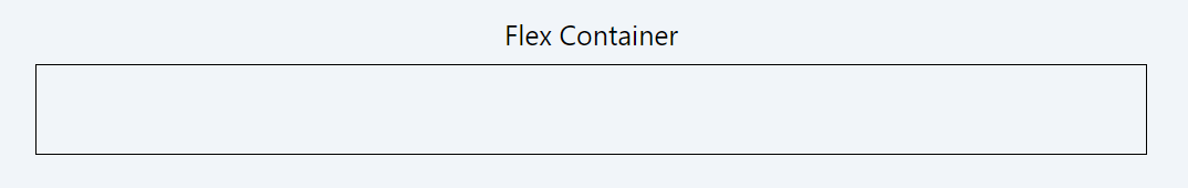
Converting a Container Element into a Flexbox Container:
To transform any container element into a Flexbox container, simply apply the 'flex' class. This class activates Flexbox's layout properties on the element, enabling flexible and responsive design capabilities within that container.
Code Snippet
<div className="flex p-8 border border-black gap-4">
            ...here we can add flex box items
</div>
Example showcasing three items of the flex box
Code Snippet
        <div className="flex p-8 border border-black gap-4 ">
          <div className='p-4 bg-pink-300 rounded-sm'>Flex Item 1</div>
          <div className='p-4 bg-pink-300 rounded-sm'>Flex Item 2</div>
          <div className='p-4 bg-pink-300 rounded-sm'>Flex Item 3</div>
        </div>
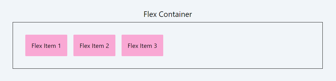
In the example above, we used the gap-4 class to create spacing between the flexbox items. This will be discussed in detail in the sections below.
2. flex-direction
In Tailwind CSS, flexbox direction classes are defined as:
flex-row: Aligns items horizontally from left to right. This is also the default value.
Code Snippet
<div className="flex flex-row p-8 border border-black gap-4 ">
            ....</div>
flex-row-reverse: Aligns items horizontally but in reverse order, from right to left.
Code Snippet
<div className="flex flex-row-reverse p-8 border border-black gap-4 ">
          .......</div>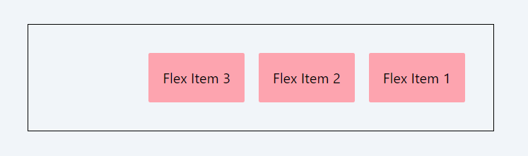
flex-col: Stacks items vertically from top to bottom.
Code Snippet
<div className="flex flex-col p-8 border border-black gap-4 ">
          .......</div>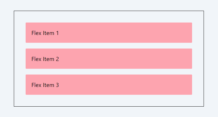
flex-col-reverse: Stacks items vertically but in reverse order, from bottom to top.
Code Snippet
<div className="flex flex-col-reverse p-8 border border-black gap-4 ">
          .......</div>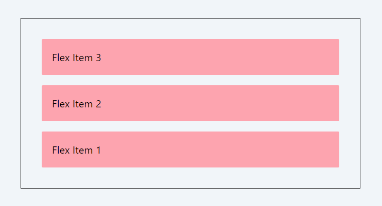
3. gap
Tailwind CSS provides a comprehensive set of utilities for managing gaps in Flexbox layouts. The gap properties control the spacing between flex items within a flex container. Let's break down the pattern of these classes:
gap-{size}:
- Purpose: Sets both the row and column gaps in a flex container.
- Usage: gap-{size}, where {size} represents the spacing size, ranging from Tailwind's default spacing scale (0, px, 0.5, 1, etc.).
Example:
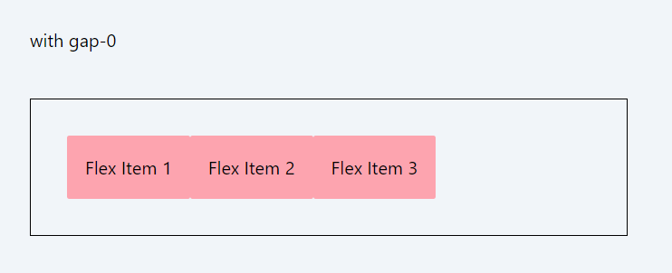
gap-0: Sets both row and column gaps to 0px.
gap-px: Sets both row and column gaps to 1px.
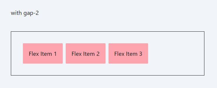
gap-2: Sets both row and column gaps to 0.5rem (8px).
Code Snippet
<div className="flex p-8 border border-black gap-0 ">...
</div>
Code Snippet
<div className="flex p-8 border border-black gap-2 ">...
</div>
gap-x-{size}:
- Purpose: Specifically sets the horizontal gap between flex items.
- Usage: gap-x-{size}, where {size} follows Tailwind's spacing scale.
Example:
- gap-x-0: Sets column gap to 0px.
- gap-x-px: Sets column gap to 1px.
- gap-x-2: Sets column gap to 0.5rem (8px).
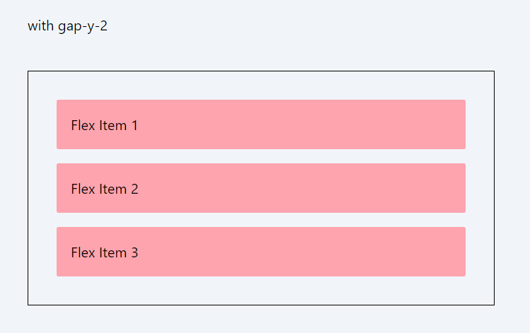
gap-y-{size}:
- Purpose: Specifically sets the vertical gap between flex items.
- Usage: gap-y-{size}, again based on Tailwind's default scale.
Example:
- gap-y-0: Sets row gap to 0px.
- gap-y-px: Sets row gap to 1px.
- gap-y-2: Sets row gap to 0.5rem (8px).
Code Snippet
<div className="flex flex-col p-8 border border-black gap-y-2 ">...
</div>
The {size} in these classes corresponds to spacing sizes defined in Tailwind's configuration. For example, 1 typically represents 0.25rem, 2 is 0.5rem, and so on, up to larger values for more significant gaps. These classes allow for precise control over the spacing between flex items, enabling responsive and visually appealing layouts.
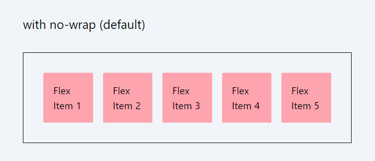
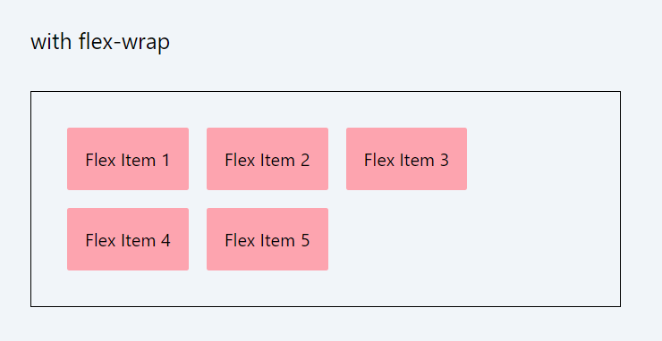
4. flex-wrap
In Tailwind CSS, the flex-wrap classes are used to control how flex items are wrapped within a container. These classes are essential for managing the layout and behavior of flex items when the available space within the container is limited.
- flex-wrap: Enables flex items to wrap onto multiple lines, from top to bottom.
- flex-wrap-reverse: Flex items wrap onto multiple lines from bottom to top.
- flex-nowrap: Prevents flex items from wrapping, keeping them in a single line. This is also the default value.
Code Snippet
          <div className="flex flex-nowrap p-8 border border-black gap-4 ">
            ...
          </div>
Code Snippet
          <div className="flex flex-wrap p-8 border border-black gap-4 ">
            ...
          </div>
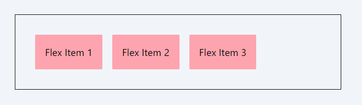
5. justify-content
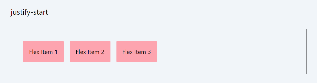
The justify-content classes in Tailwind CSS align items within a container along the main axis:
- justify-start: Aligns items to the start of the container.
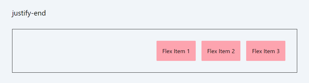
- justify-end: Aligns items to the end of the container.
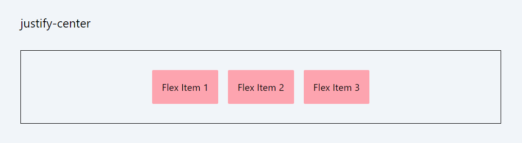
- justify-center: Centers items in the container.
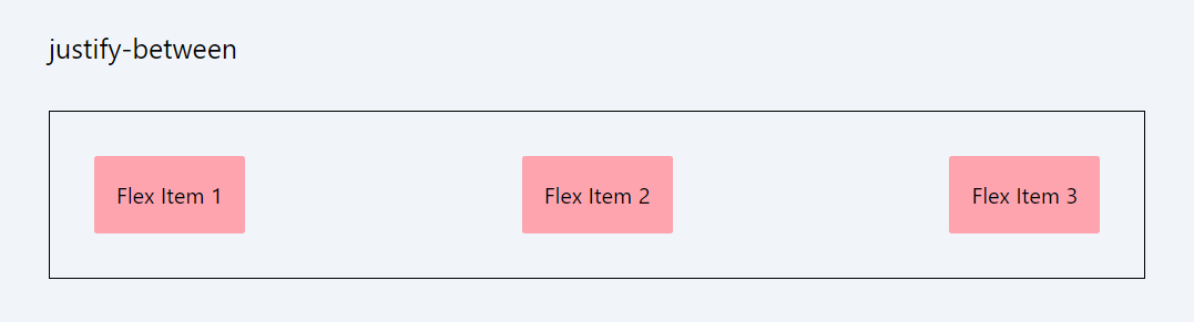
- justify-between: Distributes items evenly with the first item at the start and the last at the end.
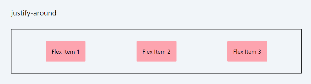
- justify-around: Distributes items with equal space around them.
- justify-evenly: Items are evenly distributed with equal space between them.
These classes provide flexibility in aligning items horizontally or vertically (based on flex direction) within their container.
Example: justify-start:
Code Snippet
<div className="flex justify-start p-8 border border-black gap-4 ">
            <div className='p-4 bg-rose-300 rounded-sm'>Flex Item 1</div>
            <div className='p-4 bg-rose-300 rounded-sm'>Flex Item 2</div>
            <div className='p-4 bg-rose-300 rounded-sm'>Flex Item 3</div>
</div>
Example: justify-end:
Code Snippet
<div className="flex justify-end p-8 border border-black gap-4 ">
            <div className='p-4 bg-rose-300 rounded-sm'>Flex Item 1</div>
            <div className='p-4 bg-rose-300 rounded-sm'>Flex Item 2</div>
            <div className='p-4 bg-rose-300 rounded-sm'>Flex Item 3</div>
</div>
Example: justify-center:
Code Snippet
<div className="flex justify-center p-8 border border-black gap-4 ">
            <div className='p-4 bg-rose-300 rounded-sm'>Flex Item 1</div>
            <div className='p-4 bg-rose-300 rounded-sm'>Flex Item 2</div>
            <div className='p-4 bg-rose-300 rounded-sm'>Flex Item 3</div>
</div>
Example: justify-center:
Code Snippet
<div className="flex justify-between p-8 border border-black gap-4 ">
            <div className='p-4 bg-rose-300 rounded-sm'>Flex Item 1</div>
            <div className='p-4 bg-rose-300 rounded-sm'>Flex Item 2</div>
            <div className='p-4 bg-rose-300 rounded-sm'>Flex Item 3</div>
</div>
Example: justify-around:
Code Snippet
<div className="flex justify-around p-8 border border-black gap-4 ">
            <div className='p-4 bg-rose-300 rounded-sm'>Flex Item 1</div>
            <div className='p-4 bg-rose-300 rounded-sm'>Flex Item 2</div>
            <div className='p-4 bg-rose-300 rounded-sm'>Flex Item 3</div>
</div>
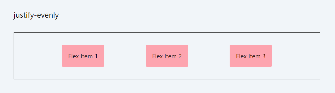
Example: justify-around:
Code Snippet
<div className="flex justify-evenly p-8 border border-black gap-4 ">
            <div className='p-4 bg-rose-300 rounded-sm'>Flex Item 1</div>
            <div className='p-4 bg-rose-300 rounded-sm'>Flex Item 2</div>
            <div className='p-4 bg-rose-300 rounded-sm'>Flex Item 3</div>
</div>
Important: There is another class with the name justify-stretch. However, for flexboxes, the stretch value behaves as start. This is because, in flexboxes, stretching is controlled using the flex-grow property, which we will study in the next lesson. The justify-stretch class can be used in CSS grids.
6. align-items
The align-items classes in Tailwind CSS are used to align flex items vertically within a container and they become particularly useful when the items have different heights.
- items-start: Aligns items to the start of the cross axis.
- items-end: Aligns items to the end of the cross axis.
- items-center: Centers items along the cross axis.
- items-baseline: Aligns items along their baselines.
- items-stretch: Stretches items to fill the container (default behavior if no align-items class is specified).
These classes are key for controlling the vertical alignment of items within a flex container, especially useful in responsive layouts.
Example: items-start:
Code Snippet
<div className="flex items-start border border-gray-600 black gap-4 bg-stripes rounded "> <div className='p-4 bg-cyan-500 text-white rounded-sm '>Flex Item 1</div> <div className='p-10 bg-cyan-500 text-white rounded-sm'>Flex Item 2</div> <div className='p-8 bg-cyan-500 text-white rounded-sm'>Flex Item 3</div></div>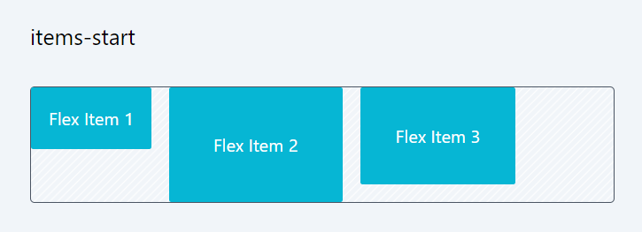
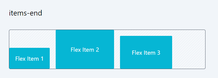
Example: items-end:
Code Snippet
<div className="flex items-end border border-gray-600 gap-4 bg-stripes rounded">
          <div className='p-4 bg-cyan-500 text-white rounded-sm '>Flex Item 1</div>
            <div className='p-10 bg-cyan-500 text-white rounded-sm'>Flex Item 2</div>
            <div className='p-8 bg-cyan-500 text-white rounded-sm'>Flex Item 3</div>
</div>
Example: items-center:
Code Snippet
<div className="flex items-center p-8 border border-gray-600 gap-4 bg-stripes rounded "> <div className='p-4 bg-cyan-500 text-white rounded-sm '>Flex Item 1</div> <div className='p-10 bg-cyan-500 text-white rounded-sm'>Flex Item 2</div> <div className='p-8 bg-cyan-500 text-white rounded-sm'>Flex Item 3</div></div>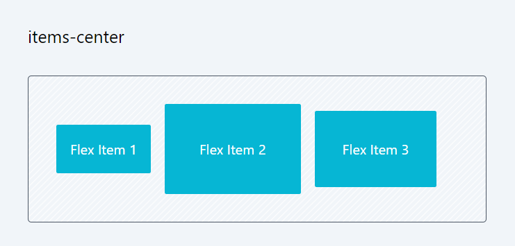
Example: items-baseline
Code Snippet
<div className="flex items-baseline p-8 border border-gray-600 gap-4 bg-stripes rounded "> <div className='p-4 bg-cyan-500 text-white rounded-sm '>Flex Item 1</div> <div className='p-10 bg-cyan-500 text-white rounded-sm'>Flex Item 2</div> <div className='p-8 bg-cyan-500 text-white rounded-sm'>Flex Item 3</div> </div>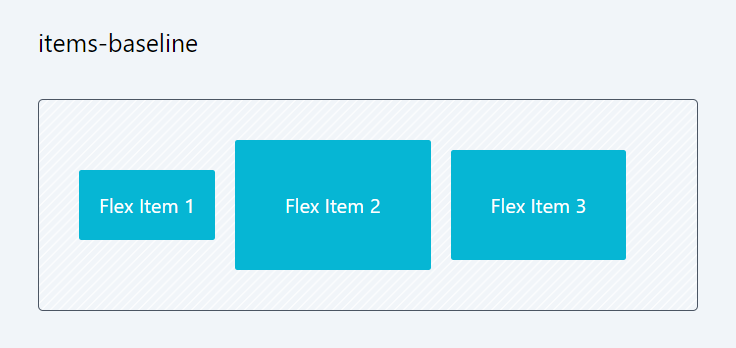
Example: items-stretch
Code Snippet
<div className="flex items-stretch p-8 border border-gray-600 gap-4 bg-stripes rounded "> <div className='p-4 bg-cyan-500 text-white rounded-sm '>Flex Item 1</div> <div className='p-10 bg-cyan-500 text-white rounded-sm'>Flex Item 2</div> <div className='p-8 bg-cyan-500 text-white rounded-sm'>Flex Item 3</div> </div>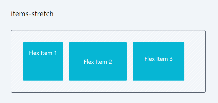
7. align-content:
The align-content classes in Tailwind CSS control the alignment of flex lines in a multi-line flex container. The align-content property in flexbox becomes more meaningful when the container's height is relatively large or when you have multiple rows or columns of flex items within the container.
- content-center: Centers lines within the container.
- content-start: Aligns lines to the start of the container.
- content-end: Aligns lines to the end of the container.
- content-between: Distributes lines evenly, with the first line at the start and the last at the end.
- content-around: Distributes lines with equal space around each line.
- content-evenly: Distributes lines with equal space between them.
Note that if you set align-content classes while flex-wrap is set to nowrap, a warning will appear in the developer window. This is because align-content only functions in a multi-line flex container. It won't have any effect in single-line layouts, which is why the warning is generated.warning: The flex-wrap: nowrap property prevents align-content from having an effect. Try setting flex-wrap to something other than nowrap.
Example: content-start
Code Snippet
<div className="flex flex-wrap content-start border border-gray-600 gap-4 bg-stripes rounded h-64"> <div className='p-4 bg-cyan-500 text-white rounded-sm '>Flex Item 1</div> <div className='p-4 bg-cyan-500 text-white rounded-sm'>Flex Item 2</div> <div className='p-4 bg-cyan-500 text-white rounded-sm'>Flex Item 3</div> <div className='p-4 bg-cyan-500 text-white rounded-sm'>Flex Item 4</div> <div className='p-4 bg-cyan-500 text-white rounded-sm'>Flex Item 5</div> </div>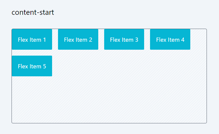
Example: content-center
Code Snippet
<div className="flex flex-wrap content-center border border-gray-600 black gap-4 bg-stripes rounded h-64 "> <div className='p-4 bg-cyan-500 text-white rounded-sm '>Flex Item 1</div> <div className='p-4 bg-cyan-500 text-white rounded-sm'>Flex Item 2</div> <div className='p-4 bg-cyan-500 text-white rounded-sm'>Flex Item 3</div> <div className='p-4 bg-cyan-500 text-white rounded-sm'>Flex Item 4</div> <div className='p-4 bg-cyan-500 text-white rounded-sm'>Flex Item 5</div> </div>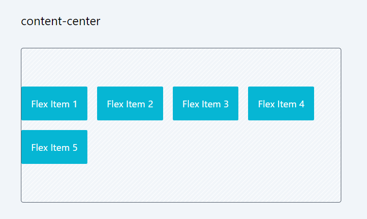
In this session, we explored a variety of classes applicable to the flexbox container, influencing the appearance and behavior of items within it. Grasping these properties might initially seem daunting, but as you progress in component development, these classes will become a routine part of your daily toolkit.
In the next lesson, we will explore the classes that can be applied to the flexbox items, which change the specific behavior of an item within a container.
In this lesson, we will examine the flex item properties in CSS, which control how individual items behave within a Flexbox container. These properties determine the item's size, order, and alignment relative to other items and the container itself.
All Modules