✅ Now Live: Advanced Order Store for All Business Types – Rentals, Services, Subscriptions & More!✅ Now Live: Advanced Order Store for All Business Types – Rentals, Services, Subscriptions & More!✅ Now Live: Advanced Order Store for All Business Types – Rentals, Services, Subscriptions & More!✅ Now Live: Advanced Order Store for All Business Types – Rentals, Services, Subscriptions & More!✅ Now Live: Advanced Order Store for All Business Types – Rentals, Services, Subscriptions & More!✅ Now Live: Advanced Order Store for All Business Types – Rentals, Services, Subscriptions & More!✅ Now Live: Advanced Order Store for All Business Types – Rentals, Services, Subscriptions & More!✅ Now Live: Advanced Order Store for All Business Types – Rentals, Services, Subscriptions & More!✅ Now Live: Advanced Order Store for All Business Types – Rentals, Services, Subscriptions & More!✅ Now Live: Advanced Order Store for All Business Types – Rentals, Services, Subscriptions & More!
Flexbox Items Tailwind Utility Classes
In this lesson, we will examine the flex item properties in CSS, which control how individual items behave within a Flexbox container. These properties determine the item's size, order, and alignment relative to other items and the container itself.
Flex item properties in CSS control how individual items behave within a Flexbox container. They determine the item's size, order, and alignment relative to other items and the container.
1. order:
In Tailwind CSS, the order classes control the order of flex items within a flex container. They are based on a predefined set of order values.
These classes include:
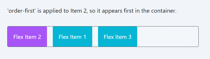
- order-first: This class places the flex item first, regardless of its position in the HTML.
- order-last: Places the flex item last within the flex container.
- order-none: Resets the order of the item to its natural position, as if no order was applied.
- order-1 to order-12. The numbered order- classes (order-1 to order-12) are used to specify the order of flex items within a flex container. Each class sets a specific order value for an item. For example, order-1 places the item first, order-2 second, and so on, up to order-12.
Code Snippet
          <div className="flex  border border-gray-600 black gap-4 bg-stripes rounded">
            <div className='p-4 bg-cyan-500 text-white rounded-sm '>Flex Item 1</div>
            <div className='p-4 bg-purple-500 text-white rounded-sm order-first'>Flex Item 2</div>
            <div className='p-4 bg-cyan-500 text-white rounded-sm'>Flex Item 3</div>
          </div>
2. flex-grow:
In Tailwind CSS, the flex-grow classes are used to control the ability of a flex item to grow if necessary:
- grow: Enables the flex item to grow to fill any available space in the container. It's equivalent to setting flex-grow: 1; in CSS.
- grow-0: Disables the growing feature of the flex item, meaning it won't expand beyond its original size.
Code Snippet
<div className="flex border border-gray-600 black gap-4 bg-stripes rounded"> <div className='p-4 bg-cyan-500 text-white rounded-sm '>Flex Item 1</div> <div className='p-4 bg-purple-500 text-white rounded-sm grow'>Flex Item 2</div> <div className='p-4 bg-cyan-500 text-white rounded-sm'>Flex Item 3</div> </div>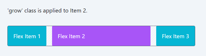
3. flex-shrink:
In Tailwind CSS, the flex-shrink classes determine how a flex item will shrink relative to others in a flex container:
- shrink: This class allows the flex item to shrink if necessary. It's equivalent to setting flex-shrink: 1; in CSS, meaning the item can shrink proportionally if there isn't enough space in the container.
- shrink-0: Prevents the flex item from shrinking, regardless of the space available. It sets flex-shrink: 0;, ensuring the item maintains its original size even in a space-constrained container.
Code Snippet
<div className="flex border black gap-4 bg-stripes rounded"> <div className='p-4 bg-cyan-500 text-white rounded-sm shrink-0'>Flex Item 1</div> <div className='p-4 bg-purple-500 text-white rounded-sm shrink'>Flex Item 2</div> <div className='p-4 bg-cyan-500 text-white rounded-sm shrink-0'>Flex Item 3</div> <div className='p-4 bg-cyan-500 text-white rounded-sm shrink-0'>Flex Item 4</div> <div className='p-4 bg-cyan-500 text-white rounded-sm shrink-0'>Flex Item 5</div> </div>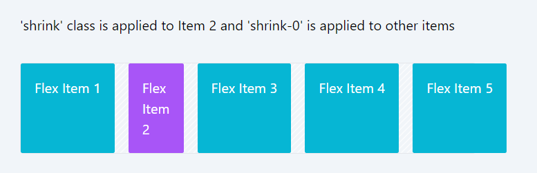
4. flex-basis:
Tailwind CSS provides a comprehensive set of flex basis classes, which allow you to control the initial size of flex items before they are adjusted by the flex-grow and flex-shrink properties. The flex basis property in CSS is specified by the flex-basis attribute, and Tailwind's utility classes make it easy to apply these values directly in your HTML.
Absolute Sizes (basis-0 to basis-96, basis-auto, basis-px, and basis-0.5 to basis-3.5):
These classes set the flex-basis property to a specific size. For instance, basis-0 sets the flex-basis to 0px, basis-1 to 0.25rem (or 4px), and so forth, up to basis-96 which is 24rem (or 384px).
The class basis-auto sets the flex-basis to 'auto', allowing the item to size based on its content.
basis-px sets it to exactly 1px, and the classes like basis-0.5, basis-1.5, etc., provide fine-grained control over the flex-basis with small increments.
Fractional Sizes (basis-1/2 to basis-11/12, basis-full): These classes represent fractional parts of the flex container’s size. For example, basis-1/2 sets the flex-basis to 50% of the container's size, basis-1/3 to 33.333333%, and so on. Basis-full sets the flex-basis to 100% of the container’s size.
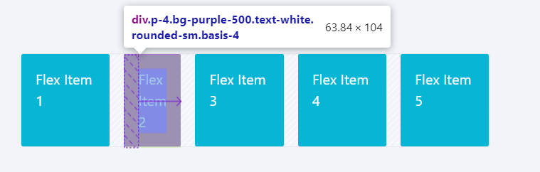
In the above example, we have set basis-4 for flex item 2. Note that its initial size is set to 1rem, but it expands later to accommodate the content and adjust within the container. This behavior is also depicted in the Chrome browser's developer tools.
Code Snippet
<div className="flex border black gap-4 bg-stripes rounded"> <div className='p-4 bg-cyan-500 text-white rounded-sm '>Flex Item 1</div> <div className='p-4 bg-purple-500 text-white rounded-sm basis-4'>Flex Item 2</div> <div className='p-4 bg-cyan-500 text-white rounded-sm '>Flex Item 3</div> <div className='p-4 bg-cyan-500 text-white rounded-sm '>Flex Item 4</div> <div className='p-4 bg-cyan-500 text-white rounded-sm '>Flex Item 5</div> </div>5. flex:
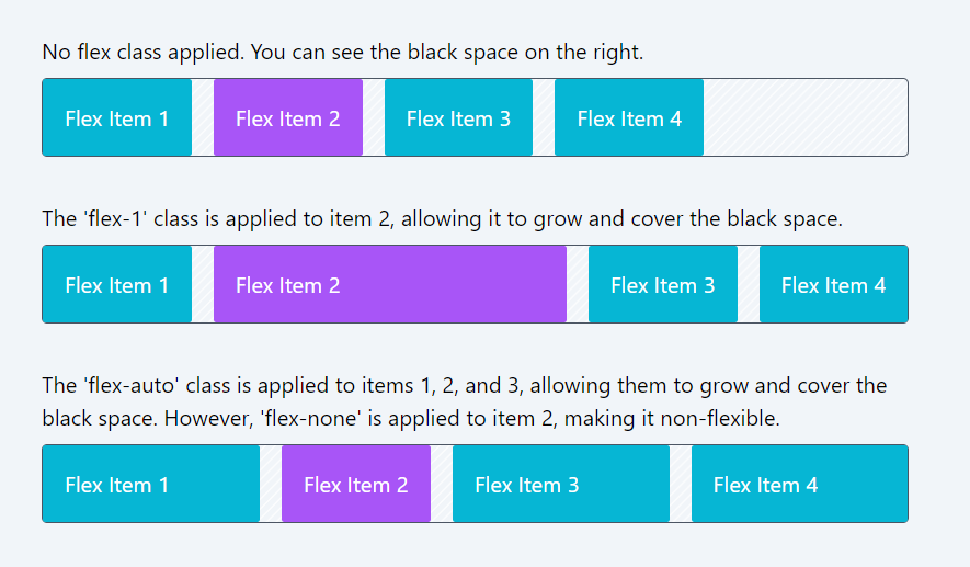
In Tailwind CSS, the shorthand flex classes define the flexibility of an item:
- flex-1: Sets flex: 1 1 0%, making the item flexible and allowing it to grow and shrink. It starts with a flex-basis of 0%, meaning it doesn't initially consider the item's natural size.
- flex-auto: Sets flex: 1 1 auto, allowing the item to grow and shrink according to its content. The initial size is based on the item's natural content size due to flex-basis: auto.
- flex-initial: Sets flex: 0 1 auto, making the item flexible with an initial size based on its content. However, flex-grow is 0, so it won't grow beyond this initial size, although it can still shrink if necessary.
- flex-none: Sets flex: 0 0 auto, disabling the item's flexibility. This means it won't grow or shrink from its initial size, which is determined by its content or an explicit size setting.
6. align-self:
In Tailwind CSS, align-self classes allow individual flex items to override the alignment specified by the container's align-items property:
- self-auto: Inherits the container's alignment setting.
- self-start: Aligns the item at the start of the cross axis.
- self-end: Aligns the item at the end of the cross axis.
- self-center: Centers the item along the cross axis.
- self-stretch: Stretches the item to fill the container's cross size.
- self-baseline: Aligns the item based on the baseline alignment of the other items.
These classes provide flexibility in aligning items within a Flexbox container.
Code Snippet
<div className="flex border border-gray-600 black gap-4 bg-stripes rounded h-32"> <div className='p-4 bg-cyan-500 text-white rounded-sm self-start'>Flex Item 1</div> <div className='p-4 bg-purple-500 text-white rounded-sm self-center'>Flex Item 2</div> <div className='p-4 bg-cyan-500 text-white rounded-sm self-end'>Flex Item 3</div> <div className='p-4 bg-cyan-500 text-white rounded-sm self-stretch'>Flex Item 4</div> </div>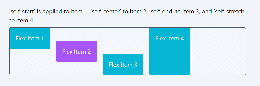
In this module, we have covered flexbox container and flexbox item classes in detail. We suggest you practice and start creating components using these classes. Some of the components you can make with flexbox include headers, footers, toolbars, and galleries.
In the next module, we will explore CSS Grids, another method for building layouts and arranging items. We will also examine the differences between Flexbox and Grid in the upcoming module, providing guidelines on when to use each - whether Flexbox or CSS Grids.
In this lesson, let's explore some questions that will help you solidify your understanding of Flexbox.
All Modules