✅ Now Live: Advanced Order Store for All Business Types – Rentals, Services, Subscriptions & More!✅ Now Live: Advanced Order Store for All Business Types – Rentals, Services, Subscriptions & More!✅ Now Live: Advanced Order Store for All Business Types – Rentals, Services, Subscriptions & More!✅ Now Live: Advanced Order Store for All Business Types – Rentals, Services, Subscriptions & More!✅ Now Live: Advanced Order Store for All Business Types – Rentals, Services, Subscriptions & More!✅ Now Live: Advanced Order Store for All Business Types – Rentals, Services, Subscriptions & More!✅ Now Live: Advanced Order Store for All Business Types – Rentals, Services, Subscriptions & More!✅ Now Live: Advanced Order Store for All Business Types – Rentals, Services, Subscriptions & More!✅ Now Live: Advanced Order Store for All Business Types – Rentals, Services, Subscriptions & More!✅ Now Live: Advanced Order Store for All Business Types – Rentals, Services, Subscriptions & More!
Flexbox
In this lesson, we will delve into the fundamental concepts of flexbox, focusing on both the flexbox container and flexbox items. The flexbox layout model is an efficient and streamlined approach to designing complex layouts with CSS, offering a more flexible and predictable way to arrange elements within a webpage.
Flexbox in CSS is a layout model designed for building one-dimensional layouts. It allows for efficient alignment and distribution of space among items in a container, even when their size is unknown or dynamic.
Flexbox Container
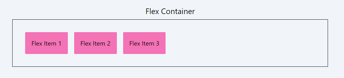
A Flexbox container is an element with the display: flex or display: inline-flex property. This container holds and positions flex items according to the Flexbox model.
Flexbox Items
Flex items are the immediate children of a Flexbox container. They can be flexibly aligned, ordered, and sized within the container. Properties like flex-grow, flex-shrink, and flex-basis control how they expand, contract, and occupy space within the Flexbox container.
Which Element can be a flexbox Container
In Flexbox, any container element that can nest other elements can become a Flexbox container. This includes commonly used elements like <div>, <section>, and <article>, as well as inline elements such as <span>. Even structural elements like <header>, <footer>, <nav>, and <p> can be Flexbox containers. By setting the display property of these elements to flex or inline-flex, they adopt the Flexbox layout model, enabling their children to be flex items with flexible alignment, ordering, and sizing capabilities.
Which Element can be a flexbox Items
In Flexbox, any element placed inside a Flexbox container automatically becomes a flex item. This includes all HTML elements, such as <div>, <span>, <p>, <img>, and even semantic elements like <section> or <header>.
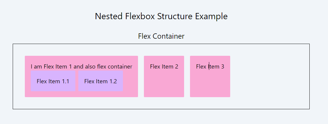
Flexbox's versatility extends to nested designs: a Flexbox container can also be a flex item within another Flexbox container.
In the below example, we have a main flex container. This container has three child divs (flex items: flex item 1, flex item 2, flex item 3).
Nested Flex Container (Flex Item 1): The first child div of the main flex container (Flex Item 1) is also a flex container itself. This makes it a nested flex container.
Inside this nested flex container, there are two more divs (Flex Item 1.1 and Flex Item 1.2), which are its flex items.
This nested feature of flexbox allows for the creation of complex, multi-layered layouts where containers and their child elements can all benefit from Flexbox's powerful alignment and spacing capabilities.
In the upcoming lessons of this module, you'll delve into the properties of Flexbox containers and items, learning how to effectively manage them. Subsequently, we will explore the various Tailwind utility classes that allow you to control and fine-tune their behavior.
In this lesson, we're going to take a deep dive into the flexbox container utility classes offered by Tailwind CSS. Tailwind's flexbox utilities provide a powerful and intuitive set of tools for creating flexible and responsive layouts with ease. These classes leverage the capabilities of CSS Flexbox, a layout model that allows for the efficient arrangement of elements within a container, even when their size is unknown or dynamic.
All Modules