✅ Now Live: Advanced Order Store for All Business Types – Rentals, Services, Subscriptions & More!✅ Now Live: Advanced Order Store for All Business Types – Rentals, Services, Subscriptions & More!✅ Now Live: Advanced Order Store for All Business Types – Rentals, Services, Subscriptions & More!✅ Now Live: Advanced Order Store for All Business Types – Rentals, Services, Subscriptions & More!✅ Now Live: Advanced Order Store for All Business Types – Rentals, Services, Subscriptions & More!✅ Now Live: Advanced Order Store for All Business Types – Rentals, Services, Subscriptions & More!✅ Now Live: Advanced Order Store for All Business Types – Rentals, Services, Subscriptions & More!✅ Now Live: Advanced Order Store for All Business Types – Rentals, Services, Subscriptions & More!✅ Now Live: Advanced Order Store for All Business Types – Rentals, Services, Subscriptions & More!✅ Now Live: Advanced Order Store for All Business Types – Rentals, Services, Subscriptions & More!
Opacity
In this module, we will delve into Tailwind CSS's opacity classes, a powerful toolset for controlling the transparency of elements in web design. We'll explore how these classes can be used to adjust the opacity of text, backgrounds, and other elements, enhancing the visual aesthetics and user experience of a website.
Opacity in CSS determines how transparent an element is. An element with lower opacity is more transparent and allows more of the background to show through, whereas an element with higher opacity is more opaque and less of the background shows through.
In the context of Tailwind CSS, a utility-first CSS framework, opacity classes are used to control the opacity of an element directly in the HTML. These classes follow a naming pattern that is intuitive and easy to use. The pattern is opacity-[value], where [value] represents the opacity level you want to apply.
Here are some of the Tailwind opacity classes and their CSS equivalents:
- opacity-0 translates to opacity: 0; (completely transparent)
- opacity-5 translates to opacity: 0.05; (very slightly visible)
- opacity-10 translates to opacity: 0.1; (still mostly transparent)
- opacity-15 to opacity: 0.15; and so forth...
- The pattern continues up to opacity-100, which translates to opacity: 1; (completely opaque, no transparency).
The increment in these classes is in steps of 5 for fine-grained control over the transparency level. This approach allows developers to quickly adjust the transparency of elements without having to write custom CSS. For instance, if you want to make a background image slightly visible behind some text, you might use opacity-95 on the image to let the text stand out more.
Tailwind's utility classes like these for opacity provide a fast and efficient way to style elements directly within your HTML, making it easier to see the effects of your styling changes in real-time and reducing the need for additional CSS files.
Here are two practical examples of how you can use Tailwind's opacity classes in a web development context:
Example 1: Semi-Transparent Button
Scenario: You have a button on a webpage, but you want it to be slightly transparent so that it blends with the background but is still noticeable.
Explanation:
- bg-blue-600: Applies a blue background color to the button.
- text-white: Makes the text color white.
- opacity-75: Sets the button's opacity to 75%, making it semi-transparent.
- hover:opacity-100: When the user hovers over the button, its opacity changes to 100%, making it fully opaque.
Code Snippet
<button className="bg-blue-600 font-medium rounded p-3 shadow-sm text-white opacity-75 hover:opacity-100"> Book Your Appointment Today</button>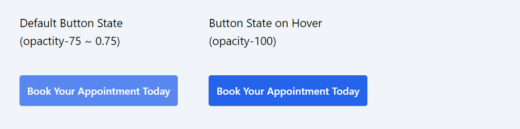
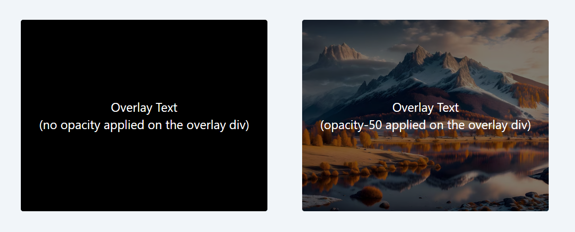
Example 2: Text Overlay on an Image
Scenario: You have an image and you want to overlay text on it. The text should be readable but should also allow the image to be visible through it.
Code Snippet
<div className="relative rounded overflow-hidden"> <img src="https://img.freepik.com/free-photo/forest-landscape_71767-127.jpg?size=626&ext=jpg" alt="Descriptive Image" /> <div className="absolute top-0 left-0 right-0 bottom-0 flex items-center justify-center bg-black opacity-50"> </div> <div className="absolute top-0 left-0 right-0 bottom-0 flex items-center justify-center"> <p className="text-white text-xl text-center "> Overlay Text <br/>(opacity-50 applied on the overlay div) </p> </div> </div>Explanation:
- The div with relative is the container that holds the image and the text overlay.
- absolute top-0 left-0 right-0 bottom-0: Positions the text overlay directly over the image.
- text-white text-xl: Sets the text color to white and size to extra-large.
- opacity-50: Makes the overlay div 50% opaque, allowing some of the image to show through the text for a blending effect.
In both these examples, the use of opacity classes adds a layer of visual interest and usability to the elements, enhancing the user experience.
In this lesson, we will delve into the use of Tailwind CSS's ring utility classes, a powerful feature for adding visually appealing rings to UI elements. Rings in Tailwind CSS are essentially special kinds of borders or shadows that encircle elements, providing an extra layer of aesthetic refinement and interactive feedback.
All Modules