✅ Now Live: Advanced Order Store for All Business Types – Rentals, Services, Subscriptions & More!✅ Now Live: Advanced Order Store for All Business Types – Rentals, Services, Subscriptions & More!✅ Now Live: Advanced Order Store for All Business Types – Rentals, Services, Subscriptions & More!✅ Now Live: Advanced Order Store for All Business Types – Rentals, Services, Subscriptions & More!✅ Now Live: Advanced Order Store for All Business Types – Rentals, Services, Subscriptions & More!✅ Now Live: Advanced Order Store for All Business Types – Rentals, Services, Subscriptions & More!✅ Now Live: Advanced Order Store for All Business Types – Rentals, Services, Subscriptions & More!✅ Now Live: Advanced Order Store for All Business Types – Rentals, Services, Subscriptions & More!✅ Now Live: Advanced Order Store for All Business Types – Rentals, Services, Subscriptions & More!✅ Now Live: Advanced Order Store for All Business Types – Rentals, Services, Subscriptions & More!
Box Shadow
In this module, we will explore Tailwind CSS's box-shadow classes, which are instrumental in adding depth and visual interest to web elements. These classes provide a simple yet effective way to apply and customize shadows, enhancing the UI's overall look and feel.
Box shadows in CSS are used to add shadow effects around an element's frame. This can enhance the user interface by providing depth, highlighting interactive elements, and improving the overall aesthetics of the design. Key uses include:
- Visual Depth and Emphasis: Box shadows create a sense of depth, making elements like buttons or cards stand out from the rest of the page.
- Focus and Interaction Indicators: They can be used to indicate focus or hover states on interactive elements.
- Aesthetic Enhancements: Box shadows are used to improve the visual appeal of elements, giving a polished and dynamic look to the interface.
Box Shadow Classes
Tailwind CSS offers a set of utility classes to easily apply box shadows, each providing a different shadow effect:
- shadow-sm: Applies a small, subtle shadow. This is a light shadow, barely noticeable, giving a slight depth to the element.
- shadow: The default shadow. It's more pronounced than shadow-sm but still relatively subtle.
- shadow-md: A medium shadow. This adds more depth and is more noticeable, suitable for elements that require emphasis.
- shadow-lg: A large shadow. It creates a significant lift effect, ideal for elements you want to stand out prominently.
- shadow-xl: An extra-large shadow. This shadow is quite deep and distinct, adding a lot of depth to the element.
- shadow-2xl: An extremely large shadow. This is very bold and is often used for significant interactive elements or areas of focus.
- shadow-inner: An inner shadow. This shadow is applied inside the element's frame, creating an inset effect.
- shadow-none: Removes any shadow. This class is used to reset or remove shadows from elements that have them by default.
Code Snippet
<div className="shadow-sm p-4 mb-4 bg-white rounded">Small Shadow</div> <div className="shadow p-4 mb-4 bg-white rounded">Default Shadow</div> <div className="shadow-md p-4 mb-4 bg-white rounded">Medium Shadow</div> <div className="shadow-lg p-4 mb-4 bg-white rounded">Large Shadow</div> <div className="shadow-xl p-4 mb-4 bg-white rounded">Extra Large Shadow</div> <div className="shadow-2xl p-4 mb-4 bg-white rounded">2XL Shadow</div> <div className="shadow-inner p-4 mb-4 bg-white rounded">Inner Shadow</div>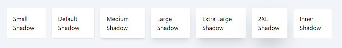
Shadow Color Utility Classes
Tailwind CSS's box-shadow color classes allow you to customize the color of box shadows. These utilities follow a pattern that integrates Tailwind's color palette, enabling you to apply various shadow colors to match or complement your design's color scheme.
The pattern for box shadow color classes in Tailwind CSS is shadow-{color}-{shade}, where {color} is the name of the color, and {shade} indicates the intensity or lightness of that color. This pattern aligns with Tailwind's color palette, providing a consistent approach to applying color to shadows.
Standard Colors:
- shadow-black: Applies a black shadow.
- shadow-white: Applies a white shadow.
Color Palette Shades:
- shadow-blue-{50-900}: Applies shades of blue, e.g., shadow-blue-500 for a medium blue shadow.
- shadow-red-{50-900}: Applies shades of red, e.g., shadow-red-300 for a light red shadow.
- shadow-green-{50-900}: Applies shades of green, e.g., shadow-green-700 for a dark green shadow.
- Additional colors include gray, yellow, indigo, purple, pink, etc., each with shades from 50 (lightest) to 900 (darkest).
Example: In this example, a div element is styled with shadow-lg to apply a large box shadow and shadow-blue-500 to color the shadow in medium blue. This combination not only adds depth to the element but also incorporates a specific color to enhance the visual appeal.
Code Snippet
<div className="shadow-lg shadow-blue-500 p-4 rounded"> Box with Large Blue Shadow </div>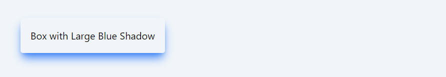
The box shadow color classes in Tailwind CSS offer a powerful way to infuse color into shadow effects, providing an additional layer of design flexibility and creativity. Whether you're accentuating a specific element or aiming for a consistent color theme, these utilities make it easy to achieve your design goals.
In this module, we will delve into Tailwind CSS's opacity classes, a powerful toolset for controlling the transparency of elements in web design. We'll explore how these classes can be used to adjust the opacity of text, backgrounds, and other elements, enhancing the visual aesthetics and user experience of a website.
All Modules