✅ Now Live: Advanced Order Store for All Business Types – Rentals, Services, Subscriptions & More!✅ Now Live: Advanced Order Store for All Business Types – Rentals, Services, Subscriptions & More!✅ Now Live: Advanced Order Store for All Business Types – Rentals, Services, Subscriptions & More!✅ Now Live: Advanced Order Store for All Business Types – Rentals, Services, Subscriptions & More!✅ Now Live: Advanced Order Store for All Business Types – Rentals, Services, Subscriptions & More!✅ Now Live: Advanced Order Store for All Business Types – Rentals, Services, Subscriptions & More!✅ Now Live: Advanced Order Store for All Business Types – Rentals, Services, Subscriptions & More!✅ Now Live: Advanced Order Store for All Business Types – Rentals, Services, Subscriptions & More!✅ Now Live: Advanced Order Store for All Business Types – Rentals, Services, Subscriptions & More!✅ Now Live: Advanced Order Store for All Business Types – Rentals, Services, Subscriptions & More!
Responsive Design Overview
In this lesson, we'll delve into responsive designs, exploring their origins and the benefits they offer for web design. Additionally, we'll outline the various design patterns that will be addressed throughout the course, providing a comprehensive understanding of creating adaptable and user-friendly web interfaces.
Responsive design stands as a cornerstone in the evolution of web design, marking a pivotal shift from static, fixed layouts to dynamic, fluid interfaces that cater to a broad spectrum of devices and screen sizes. This transformative approach ensures that websites offer an optimal viewing experience across the vast landscape of digital devices, from desktop monitors to smartphones and tablets.
The Genesis of Responsive Design
In the early days of the internet, web design was primarily focused on creating sites that looked good on desktop computers. The layouts were fixed, meaning that the design had a set width, and elements on the page had absolute positions. This approach worked well when users accessed websites from desktops or laptops with relatively standard screen sizes. However, the rapid proliferation of mobile devices, each with its own screen size and resolution, exposed the limitations of fixed layouts. Users on smaller devices often found themselves scrolling horizontally to view content or pinching and zooming to read text, leading to a frustrating and suboptimal browsing experience.
Below are key milestones and major changes in the industry, particularly focusing on the journey towards responsive web design and the mobile-first approach.
1990-1995: The Early Web
- 1991: The first website by Tim Berners-Lee goes live, marking the beginning of the World Wide Web. Web design is primarily text-based with minimal styling.
- 1993: The Mosaic web browser introduces images inline with text, paving the way for more visually engaging websites.
1996-2000: Table-Based Design and Flash
- 1996: Table-based design becomes popular for layout control, allowing for more complex, grid-based designs.
- 1996: Flash technology emerges, enabling rich animations, interactivity, and multimedia content, defining the era's web experience.
2001-2006: CSS and the Separation of Content from Design
- 2000: CSS (Cascading Style Sheets) gains wider adoption, encouraging the separation of content from design and layout.
- 2003: The rise of web standards and accessibility becomes a focus, with more websites adopting CSS for styling and layout.
2007-2010: The Rise of Mobile and Beginning of Responsive Design
- 2007: The launch of the first iPhone marks the beginning of the mobile web era, challenging designers to consider smaller screens.
- 2010: Ethan Marcotte coins the term "Responsive Web Design" (RWD), advocating for flexible grids, images, and media queries to create designs that adapt to any screen size.
2011-2014: Mobile-First and HTML5
- 2011: The mobile-first approach gains traction, prioritizing mobile design before scaling up to desktop layouts.
- 2014: HTML5 becomes the official standard, promoting semantic HTML and further enhancing multimedia and graphical content without the need for plugins like Flash.
2015-2018: The Age of Frameworks and Performance
- 2015: Google announces that mobile-friendliness will be a ranking factor in search results, emphasizing the importance of responsive design.
- 2016-2018: Web design frameworks like Bootstrap and Foundation, offering ready-made responsive components, become widely used. The focus shifts towards optimizing website performance and loading times, especially on mobile devices.
2019-2022: Advanced Interactivity and User Experience
- 2019: CSS Grid layout gains widespread support, allowing for more complex and creative web layouts.
- 2020-2022: The emphasis on user experience (UX) design intensifies, with a focus on page speed, interactivity, and visual stability. Progressive Web Apps (PWAs) become more prevalent, offering app-like experiences in the web browser.
2023-2024: The Future of Web Design
- As we look towards web design in 2023-24 and beyond, the integration of Augmented Reality (AR) is poised to redefine user interfaces, offering immersive and interactive experiences directly from web browsers. Beyond AR, we anticipate a greater emphasis on minimalistic and sustainable design practices that prioritize speed, efficiency, and environmental impact. User interfaces will likely become more dynamic and personalized, leveraging AI to adapt content and design in real-time based on user behavior and preferences.
Responsive Vs Non-Responsive Example
Let's explore how responsive and non-responsive designs adapt to different screen sizes:
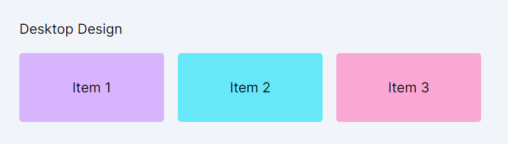
We've created a simple grid containing three items to illustrate this. First, let's examine how it appears on a desktop:
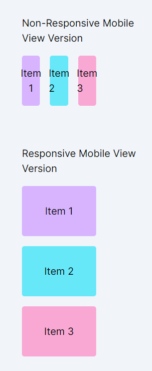
Now, let's observe the same layout on a mobile device:
- In the responsive design, it's evident that the items are neatly wrapped and shifted to the next row, allowing ample space for each item to display its content effectively. This ensures that the layout remains clear and accessible, even on smaller screens.
- On the other hand, with non-responsive design, we notice that due to the constrained space, the text begins to overflow from the boxes, leading to a compromised user interface. This demonstrates the importance of responsive design in maintaining a seamless and user-friendly experience across all devices.
Investing in Responsive Design: How It Pays Off
Responsive design directly impacts an organization's bottom line through revenue enhancement and cost savings. Here are key reasons linked to financial outcomes:
- Increased Conversion Rates: Responsive websites provide a better user experience across all devices, significantly reducing frustration due to pinching, zooming, or scrolling horizontally. A seamless experience encourages users to stay longer and engage more deeply, leading to higher conversion rates, whether that means more sales, sign-ups, or inquiries. Better conversion rates directly translate to increased revenue.
- Enhanced SEO Performance and Organic Traffic: Search engines favor mobile-friendly websites, often ranking them higher in search results. A responsive design improves your site's SEO, increasing visibility to potential customers. Higher rankings result in more organic traffic, which can lead to increased sales and ad revenue without the additional cost of paid advertising.
- Lower Development and Maintenance Costs: Maintaining separate websites for desktop and mobile users can significantly increase development and ongoing maintenance costs. Responsive design uses a single codebase that adjusts to various screen sizes, reducing the time and resources required for updates, fixes, and new features. This consolidation results in substantial cost savings over time.
- Reduced Bounce Rate and Increased Engagement: Users are more likely to leave a site that doesn’t render well on their device. A responsive website minimizes bounce rates by ensuring that all visitors have a positive experience, regardless of how they access your site. Lower bounce rates and higher engagement levels can lead to more ad revenue and a higher likelihood of completing a purchase or returning in the future.
- Future-Proofing: The digital landscape is continually evolving, with new devices and screen sizes emerging regularly. Responsive design ensures your website is prepared to adapt to these changes, avoiding the need for costly redesigns each time a new device becomes popular. This future-proofing aspect means a one-time investment in responsive design keeps paying off as technology advances, ensuring your site remains accessible and attractive to users no matter what device they use.
What we will cover in this course?
In this comprehensive course, we delve into essential design patterns that address most of the scenarios encountered when crafting responsive websites. From the implementation of flexible grids that adapt seamlessly across devices to the optimization of images for swift loading without sacrificing quality, our focus is extensive.
Utilizing Tailwind CSS's powerful and intuitive classes, we will guide you through the process of designing responsive components that ensure an optimal user experience on any screen size. This course is meticulously structured to equip you with the knowledge and skills to employ responsive design principles effectively, leveraging Tailwind CSS to streamline your workflow and enhance the adaptability of your web projects.
List of design patterns covered in this course:
Structural Patterns
These patterns focus on the foundational aspects of web design, ensuring content is adaptable and accessible across devices of varying sizes. This category effectively covers layout adjustments, navigation strategies, form adaptability, spacing, aspect ratio maintenance, accessible tables, and innovative layout solutions like off-canvas designs.
- Adaptive Layout Cards: Techniques for creating responsive card layouts that adjust to screen size.
- Magic Menus: Strategies for collapsible and dynamic navigation suited to varying screen dimensions.
- Form Flex Adapt: Design principles for creating forms that are user-friendly on any device.
- Space Crafting: Methods for adjusting spacing to enhance readability and design flow on different screens.
- Ratio Locks: Techniques for maintaining aspect ratios of embedded content, preserving visual integrity.
- Table Flow Tricks: Solutions for making tables readable and accessible on small screens.
- Canvas Slide Secrets: Utilizing off-canvas layouts to provide additional content space without cluttering the main view.
Interactive Aesthetics
This category emphasizes the enhancement of user interaction and visual presentation across different devices. These address crucial aspects like typography, image scaling, conditional visibility, alignment, and interaction modes specific to device capabilities (touch vs. mouse). Motion Adapt emphasizes the importance of integrating animations in a way that respects users' preferences and device capabilities, particularly around the prefers-reduced-motion media feature.
- Type Scale Dynamics: Adjusting typography sizes and spacing responsively for optimal readability.
- See Hide Tactics: Dynamically showing and hiding elements to suit different screen sizes and user interactions.
- Flex Align Mastery: Leveraging Flexbox for flexible and responsive element alignment.
- Touch Point Dynamics: Designing for various interaction modes, including touch and mouse, to improve user experience.
- Content Unfold: Using progressive disclosure to keep users engaged while not overwhelming them with information.
- Ghost Loaders: Implementing skeleton screens to enhance the perceived loading time of content.
- Motion Adapt: Applying responsive animation techniques to add dynamism to the user interface without sacrificing performance.
Usability Enhancements
These patterns primarily focus on enhancing the usability and accessibility of web content, emphasizing performance and accessibility for a broad audience.
- Speed Craft Strategies: Techniques for optimizing website performance, ensuring fast load times and smooth user interactions.
- Access Design Principles: Incorporating accessibility best practices to make web content universally usable, regardless of users' abilities or the devices they use.
In this lesson, we'll explore breakpoints, gaining insight into how they're utilized within Tailwind CSS for responsive design. We'll delve into mobile-first design principles, grasping their significance in prioritizing mobile user experience and optimizing for various screen sizes, ensuring our websites are accessible and functional across devices.
All Modules